
A small line such as “Scan for recipes” tells the customer why they should use it.
Need help with your packaging design?
I can help design product packaging, labels, boxes, pouches, and other packaging materials.
12. Design for the Actual Packaging Format
A label that looks good on a flat screen may not work on the actual product.
Before finalising the design, test it on the real format.
Check:
- Jar curvature
- Label size
- Pouch folds
- Seal area
- Bottle shape
- Cap and closure
- Barcode placement
- Print bleed
- Small text
- Colour changes after printing
A design for a pickle jar needs different thinking from a tea carton.
13. Make Different Flavours Easy to Identify
If you have several variants, create a clear variant system.
For example:
| Product | Main Variant Colour |
|---|---|
| Mango Pickle | Yellow |
| Chilli Pickle | Red |
| Bamboo Shoot Pickle | Green |
| Garlic Pickle | Purple |
The rest of the design stays the same.
Customers can then identify the flavour without learning a completely new package every time.
This works well for pickles, spices, tea, snacks, sauces and confectionery.
14. Keep Premium Finishes Under Control
Foil, embossing, spot UV and special papers can add cost.
You do not need all of them.
A better approach is to choose one detail that supports the design.
For example:
Matte label + small gold foil logo
can work better than:
Gloss + foil + embossing + spot UV + metallic paper
all on the same pack.
Selective finishing can also help small brands control production costs.
15. Think About Where the Product Will Be Sold
Packaging needs to work in the actual buying environment.
A product sold through:
Local grocery shops
needs strong shelf visibility.
Premium stores
may need a more refined visual system.
Instagram and D2C websites
need packaging that photographs well.
Amazon or quick-commerce platforms
need strong product recognition at small image sizes.
Gift shops
may need stronger presentation and gift appeal.
The same brand can use one identity across these channels while adjusting the packaging format and information hierarchy.
A Simple Packaging Checklist for Local Food Brands
Before sending your artwork to print, ask:
Brand
- Is the brand name easy to find?
- Does every product look like it belongs to the same brand?
Product
- Can someone understand the product in three seconds?
- Is the variant easy to identify?
Design
- Is the typography readable?
- Is the front panel too crowded?
- Does the colour system make sense?
Local identity
- Does the regional element have a real connection to the product?
- Is the use of Assamese or another local language helpful?
Information
- Are required food-label details present?
- Is the back panel easy to read?
- Has the artwork been checked against current FSSAI requirements?
Production
- Does the design fit the actual pouch, jar, bottle or box?
- Have you checked a printed proof?
- Are small text and barcode areas readable?
Digital
- Does the pack still work as a small product image?
- Does the QR code have a useful purpose?
The main idea
Local food brands do not need complicated packaging.
They need packaging that makes the product clear, gives the brand a distinct identity, uses local elements with purpose, and handles required information well.
A simple jar with a strong label can look more professional than an expensive custom package with too many design elements.
For brands in Assam and Northeast India, there is also a real opportunity to build packaging around ingredients, places and food traditions that are specific to the region. Examples such as Zizira’s Meghalaya products and Assam-focused packaging projects show how origin can become part of the visual system.
Need help with your packaging design?
I can help design product packaging, labels, boxes, pouches, and other packaging materials.
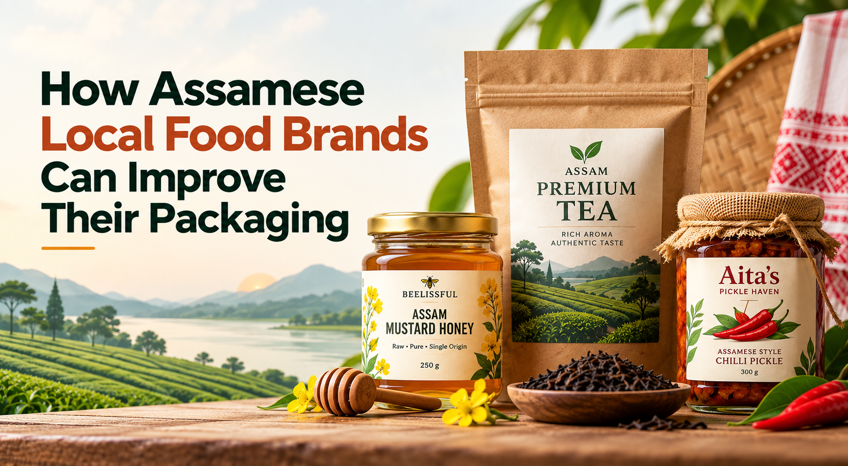
For a local food brand, packaging has a simple job: help people understand the product, trust it, and pick it up.
This matters even more for small brands. A jar of pickle, a pouch of spices, a box of tea, or a packet of snacks may sit beside products from much larger companies. The local brand may have a better product, but the pack still has to communicate its value in a few seconds.
Good packaging does not have to be expensive. A clear brand, good typography, useful information, and a consistent visual system can make a standard jar or pouch look professional.
Here are some practical ways local food brands can improve their packaging.
1. Make the Product Name Easy to See
The product name should be one of the first things people notice.
Avoid making the logo, illustration, pattern, and product name compete for attention. Use a clear hierarchy:
Brand name → Product name → Key product detail → Net quantity
For example:
BEELISSFUL
ASSAM MUSTARD HONEY
Raw • Pure • Single Origin
250 g
The customer should understand what the product is without studying the label.
This becomes even more important when the product appears as a small image on an online store or quick-commerce app. Packaging designers are increasingly testing food packs at small digital sizes as well as at full shelf size.
2. Use Local Identity With a Clear Reason
Local food brands have something large national brands often cannot copy easily: a real connection to their place.
A tea brand from Assam could use:
- Assam landscape
- Tea gardens
- Local architecture
- Regional patterns
- Assamese script
- Local illustrations
- Stories about the source of the tea
But these elements should relate to the product.
For example, a package of Assam black tea can use a simple tea-garden illustration instead of filling the pack with unrelated traditional motifs.
This approach is already visible in Northeast Indian food packaging. Zizira uses regional ingredients, illustrations and origin stories across products from Meghalaya.
3. Make the Packaging Look Like One Brand
A common problem with small food brands is that every product looks different.
The pickle has one logo style.
The honey has another colour scheme.
The spice pouch uses a different font.
The gift box looks unrelated to all of them.
Create a simple packaging system instead.
Keep these elements consistent:
- Logo position
- Brand colours
- Main typeface
- Product-name style
- Illustration style
- Information hierarchy
- Label shape
- Variant colours
Then change only the elements needed to identify each product.
This makes a small product range feel more organised without requiring expensive packaging structures.
4. Don’t Try to Put Everything on the Front
A food package has limited space.
The front panel should answer the basic questions:
What brand is this?
What is the product?
What makes this variant different?
How much is inside?
Move detailed information to the back or side.
A crowded front panel can make even a good product look cheap or confusing.
For premium products, a little empty space can also help the important information stand out.
5. Use Better Typography
Typography has a major role in food packaging.
You do not need five or six fonts. Two typefaces are often enough.
For example:
Brand: Serif
Product name: Bold sans serif
Supporting information: Regular sans serif
The important thing is contrast.
The product name should be readable from a short distance. Small supporting text should remain readable when someone holds the pack.
If your brand sells through Instagram, Amazon or other online channels, check the design at thumbnail size too.
6. Let the Food Be the Hero
Food packaging works best when the customer can understand the food quickly.
Use a good product photograph or a strong illustration when it helps explain the product.
For example:
- Mango pickle → mango
- Ginger tea → ginger and tea
- Honey → honeycomb or the actual honey
- Black rice → rice grain
- Bhut Jolokia pickle → chilli
But avoid generic stock images that make your product look like hundreds of others.
A good example of a local product range is Binzzin’s Assamese pickle packaging. The labels use simple product-specific illustrations and keep the brand identity consistent across different flavours.
Need help with your packaging design?
I can help design product packaging, labels, boxes, pouches, and other packaging materials.
7. Use Regional Language Where It Helps
Regional language can work well for local food brands.
An Assamese food brand could use Assamese alongside English. The regional script can become part of the visual identity rather than being treated as an afterthought.
For example:
আমৰ আচাৰ
Mango Pickle
or
ক’লা চাউল
Black Rice
The important information still needs to follow the applicable labelling rules. FSSAI’s current Labelling and Display Regulations allow additional languages, provided the required information is included and the additional-language information does not contradict it. Labels also need to be clear, prominent and legible.
8. Show the Origin of the Product
Origin can be a strong part of local food packaging.
Instead of simply writing:
Premium Honey
you can communicate something more specific when it is true:
Wild Forest Honey
Sourced from Meghalaya
Or:
Assam Black Rice
Grown by small farms in Assam
Specific information gives the customer something real to understand.
Taru Naturals, for example, uses packaging that connects its black rice with small-scale farms in Assam.
9. Don’t Use “Eco-Friendly” Just Because the Pack Is Brown
Kraft paper, muted colours and leaf illustrations can make packaging look natural. That does not automatically make the packaging environmentally better.
The actual material matters.
Consider:
- How much material is used
- Whether the packaging protects the food
- Whether the material is suitable for food contact
- Whether it can be recycled
- Whether local recycling systems can handle it
- Whether extra layers can be removed
Food packaging also has to meet applicable food-safety requirements. FSSAI maintains separate regulations for food packaging and has issued amendments covering packaging materials and food-contact materials.
So, choose the material for the product first. Then build the visual design around it.
10. Design the Back Panel Properly
Many small brands spend most of their time on the front label and treat the back as an afterthought.
That is a mistake.
The back panel can contain:
- Product description
- Ingredients
- Nutrition information
- Allergen information where applicable
- Storage instructions
- Manufacturing details
- Batch or lot information
- Date information
- FSSAI licence details
- Customer care information
- Barcode
- QR code
The exact requirements depend on the product and packaging type, so the final artwork should be checked against the current applicable FSSAI rules. FSSAI’s Labelling and Display Regulations set requirements for pre-packaged food labels.
Good information design matters here. Use headings, spacing and a clear type size instead of putting everything into one dense block.
11. Use QR Codes for Useful Content
A QR code can connect the physical package to your digital brand.
For example, it could open:
- A recipe
- Product story
- Farmer or sourcing information
- Instagram page
- Brand website
- Product instructions
- Customer feedback form
Do not add a QR code just because other brands have one.
Give it a clear purpose.
A small line such as “Scan for recipes” tells the customer why they should use it.
Need help with your packaging design?
I can help design product packaging, labels, boxes, pouches, and other packaging materials.
12. Design for the Actual Packaging Format
A label that looks good on a flat screen may not work on the actual product.
Before finalising the design, test it on the real format.
Check:
- Jar curvature
- Label size
- Pouch folds
- Seal area
- Bottle shape
- Cap and closure
- Barcode placement
- Print bleed
- Small text
- Colour changes after printing
A design for a pickle jar needs different thinking from a tea carton.
13. Make Different Flavours Easy to Identify
If you have several variants, create a clear variant system.
For example:
| Product | Main Variant Colour |
|---|---|
| Mango Pickle | Yellow |
| Chilli Pickle | Red |
| Bamboo Shoot Pickle | Green |
| Garlic Pickle | Purple |
The rest of the design stays the same.
Customers can then identify the flavour without learning a completely new package every time.
This works well for pickles, spices, tea, snacks, sauces and confectionery.
14. Keep Premium Finishes Under Control
Foil, embossing, spot UV and special papers can add cost.
You do not need all of them.
A better approach is to choose one detail that supports the design.
For example:
Matte label + small gold foil logo
can work better than:
Gloss + foil + embossing + spot UV + metallic paper
all on the same pack.
Selective finishing can also help small brands control production costs.
15. Think About Where the Product Will Be Sold
Packaging needs to work in the actual buying environment.
A product sold through:
Local grocery shops
needs strong shelf visibility.
Premium stores
may need a more refined visual system.
Instagram and D2C websites
need packaging that photographs well.
Amazon or quick-commerce platforms
need strong product recognition at small image sizes.
Gift shops
may need stronger presentation and gift appeal.
The same brand can use one identity across these channels while adjusting the packaging format and information hierarchy.
A Simple Packaging Checklist for Local Food Brands
Before sending your artwork to print, ask:
Brand
- Is the brand name easy to find?
- Does every product look like it belongs to the same brand?
Product
- Can someone understand the product in three seconds?
- Is the variant easy to identify?
Design
- Is the typography readable?
- Is the front panel too crowded?
- Does the colour system make sense?
Local identity
- Does the regional element have a real connection to the product?
- Is the use of Assamese or another local language helpful?
Information
- Are required food-label details present?
- Is the back panel easy to read?
- Has the artwork been checked against current FSSAI requirements?
Production
- Does the design fit the actual pouch, jar, bottle or box?
- Have you checked a printed proof?
- Are small text and barcode areas readable?
Digital
- Does the pack still work as a small product image?
- Does the QR code have a useful purpose?
The main idea
Local food brands do not need complicated packaging.
They need packaging that makes the product clear, gives the brand a distinct identity, uses local elements with purpose, and handles required information well.
A simple jar with a strong label can look more professional than an expensive custom package with too many design elements.
For brands in Assam and Northeast India, there is also a real opportunity to build packaging around ingredients, places and food traditions that are specific to the region. Examples such as Zizira’s Meghalaya products and Assam-focused packaging projects show how origin can become part of the visual system.
Need help with your packaging design?
I can help design product packaging, labels, boxes, pouches, and other packaging materials.
