
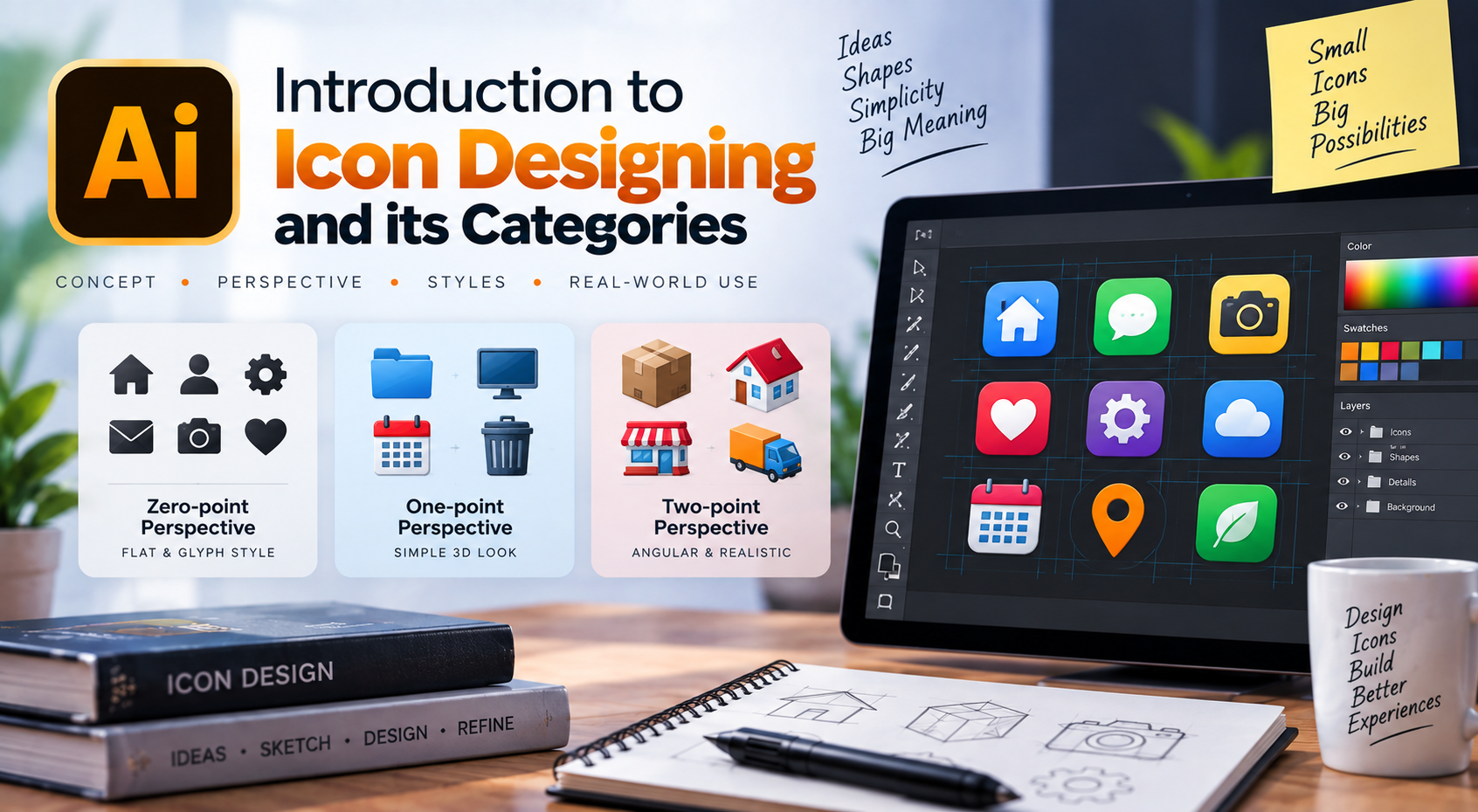
Nowadays, icons are everywhere — from cell phones to tablets, laptops to computers, websites to software… They are almost everywhere! And if you are a graphic designer, then maybe you’ve already designed a couple of logos for your clients.
Icon designing is almost similar to designing a symbolic or iconic logo type. For example, if you have to design a logo for a company and it should be symbolic/iconic, then that symbol should reflect the company’s purpose or what the company does for its clients.
Though it isn’t exactly the same as designing an icon or symbolic logo, I just tried to establish a relevance between icon designing and symbolic logo designing.
Now let’s take an example of why I’m making a connection between icon and symbolic logo designing. Suppose you are going to design an icon for a regular calendar. How will you do it? If you have never seen a calendar or don’t know what a calendar is, then can you design an icon for it? Never.
So, we should have sufficient knowledge of what we are going to design and always keep in mind how the subject looks in real life, so that we can convert it into a proper icon.
Similarly, you should know everything about the company before you start designing a logo for them. Symbolic logos may contain text with them, and we call them Combination Mark logos. They are more recognizable to consumers.
But in icons, we don’t have any text within them to describe what they represent. It is like drawing an imperfect elephant and writing “elephant” on it. We can’t do that with icons. You have to make people understand what that particular icon means through its design and shape.
So, in my viewpoint, it is more difficult to design an icon than to design a symbolic or iconic logo.
So let’s dig into icon designing categories.
Basically, there are three icon types that you might have noticed, or you can say there are three categories of icon designing. They are:
- Zero-point perspective
- One-point perspective
- Two-point perspective
The choice is yours as to which category you want to use for your icons. But remember, if you are going to design an icon set containing a minimum of six icons, then always choose a single category.
For example, if you are going to design your first icon from the set in two-point perspective, then you have to design the remaining five icons in two-point perspective as well. Otherwise, your icon set won’t look consistent or professional.
However, it is perfectly suitable to design an icon in any category if it is a single icon and doesn’t belong to an icon set.
Before I explain the three categories of icon designing, you must first be familiar with perspective designing.
Zero-point perspective icon
Zero means there is no vanishing point in it. Only parallel lines exist. That means there is no any side-view or top-view in the icons. What we see is only the front side. We can give it depth-of-field by adding color variations. Basically we see Zero-point perspective in glyph-style icons, which are popular in mobile devices, web applications or toolbar icons. Here are some examples of Zero-point perspective solid-style and glyph-style icon set.

One-point perspective icon
An icon which contains only one vanishing point is called One-point perspective icon. Rather than looking flat like Zero-point perspective icons, it has some 3D effect and looks more realistic. We can draw One-point perspective icons either by intersecting picture plane on X-axis (i.e. horizontally) or on Y-axis (i.e. vertically). Here are few examples of One-point perspective icons.

Two-point perspective icon
If you want to show two sides of your icons, than you’ve to draw them in Two-point perspective. It is almost similar with one-point perspective. The difference is that, in One-point perspective, we just see one side of an icon but in Two-point perspective, we see two sides of an icon. Two-point perspective contains two vanishing points in its horizon line and can make icons more realistic than one-point or zero-point perspective icons. These kinds of icons are positioned in an angular position and the nearest part of the icon to its viewers is its corner. For better understanding, here are some examples.

So we end up our Introduction to icon designing and its categories and I hope it will help you to understand icons even better than before. If you are new to this field, then I’ll suggest you to start with basic pencil and (graph) paper method. For experts, they can use some vector graphic software like Adobe Illustrator or Inkscape for developing their concepts. Good luck. Have a great time designing icons.
